So you’re ready to build a website but don’t know how to get started. Don’t worry; we’ve all been there.
One of the first steps is finding the best website builder to meet your needs based on the type of website you’re trying to create. But if you run a Google search for website builders, you’ll quickly realize that there are dozens of options to choose from. This can be a bit intimidating.
If you’ve never built a website before, it might be tough to tell the difference between a good website builder and a platform that’s going to give you nothing but problems.
That’s what inspired me to write this guide. Everyone else out there is telling you what website builders you should be using, but very few people are telling you which ones to avoid.
Before you get started, ask yourself if a website builder, in general, is even your best option.
For those of you who are experts in HTML, CSS, and want complete control and customization from the backend, you might not be happy using a website builder to create your site. This is especially true if you’re trying to create a site that’s intended to become the next Facebook or something like that.
But for everyone else, using a website builder to create your site will likely be your best option.
Website builders are great for small business owners, ecommerce sites, selling services online, photography portfolios, hotels, restaurants, blogs, and personal sites. It’s the perfect way to build a site if you don’t know much about coding, design, HTML, or CSS.
How to evaluate a website builder
Now that you’ve decided that a website builder is your best option, it’s time to figure out which platform to use. Once you start browsing the web, there are specific indicators you should be looking for to determine if a website builder is suitable for you.
At the same time, there are also certain red flags that will tell you if the site builder is one that should be avoided altogether.
These are the factors that need to be taken into consideration when you’re evaluating a website builder.
User experience
In this case, you’re the user who needs to be having a good experience. That’s why you need to pick a website builder that’s very easy to use.
If it has complex navigation, doesn’t offer drag and drop building, and makes it difficult to preview the pages you’re working on, then you’re going to struggle.
On the flip side, you don’t want to go with a website builder that has been simplified to the point where you lose the ability to complete certain functions.
I always recommend starting with a free trial of a website builder before you commit. The week or two that they give you for free will be a good indication of the builder’s ease of use.
If you’re experiencing too much friction, it’s in your best interest to explore other options.
Support
Once you decide on an option, it doesn’t automatically mean that you’re going to become an expert at building websites overnight. There’s a good chance that you’re going to have some questions that require assistance along the way.
So make sure you pick a website builder that offers great customer support.
For example, Wix has exceptional support pages.
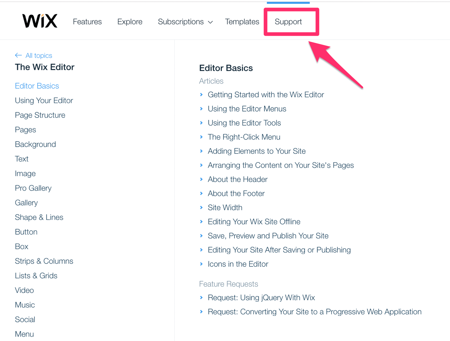
These are all of the guides and articles they offer related to the editor basics. They also have extensive guides about:
- Plans
- Domains
- Site management
- Mailboxes
- Mobile editor
- Wix stores
- Technical difficulties
- Marketing tools
- SEO
The list goes on and on. Furthermore, Wix offers 24/7 support if you need additional assistance that requires the help of a customer service representative.
As one of the top website builders on the market, you can always refer to Wix support and compare it to the builder that you’re evaluating to see how it stacks up. See if the other option provides tutorials or access to representatives when you’re in a bind and need help right away.
Features
I briefly mentioned this before when we were discussing ease of use. You don’t want to pick a website builder so simple that you end up losing features.
You need to make sure that everything you want to do on your site is available.
Right now your site might be something basic, like a blog. But in the future, you may want to expand and add things like a shopping cart to build an ecommerce website.
- Mobile-friendly design
- Image gallery for portfolios
- Templates
- SEO checker
- Profiles for site visitors
- Password protection for pages and content
- Connect your domain name (even if you didn’t buy the domain directly from the builder)
For those of you who haven’t purchased a domain yet, you can check out my guide on the best domain registrars.
Quality
At the end of the day, you don’t want the process of building and managing your website to interfere with your final product.
The people who land on your website don’t care what builder you’re using or how difficult it was for you to create it. First impressions matter. All they want to see is a professional site that’s legitimate and user-friendly.
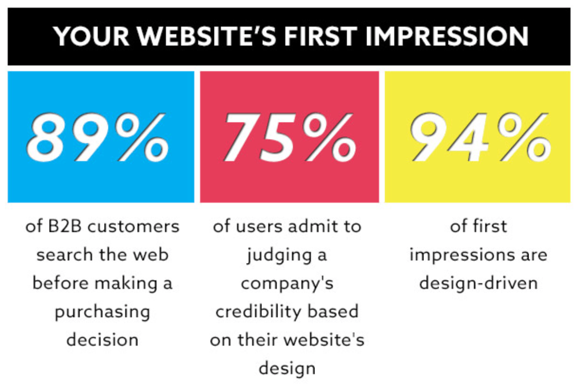
You can’t afford to overlook this reality as a new website.
Think about it from the perspective of people landing on your site.
How can get you them to stay on your site and keep coming back in the future? If your website builder is making your site look unprofessional or untrustworthy, you’re going to struggle with this.
Furthermore, you don’t want to have a website that looks basic and cookie-cutter.
Performance
Website speed and uptime are two factors that can’t be overlooked when you’re evaluating a website builder.

83% of people expect a web page to load in three seconds or less.
Most website builders will claim to have 99.9% uptime and lightning fast loading speed. But you can’t always take their word for it.
Like any other product or service you buy online, you should read reviews. See if other website owners are complaining about the website builder and the performance of their sites.
While nearly every website builder will have some negative reviews, it’s definitely a red flag if you see more bad reviews than good ones for a particular builder.
Price
When it comes to picking the best website builder, cheaper isn’t always better. But at the same time, the most expensive options don’t always equate top quality.
It’s all about value.
Find a website builder that has different options based on your specific needs.
Look for transparent pricing. Some builders will try to fool you by signing you up at a promotional rate. Then all of a sudden six months later you’re paying triple the price that you initially agreed to. So make sure you read all of the fine print before you pay for anything.
Webs
One of the first website builders that I’d avoid is Webs.
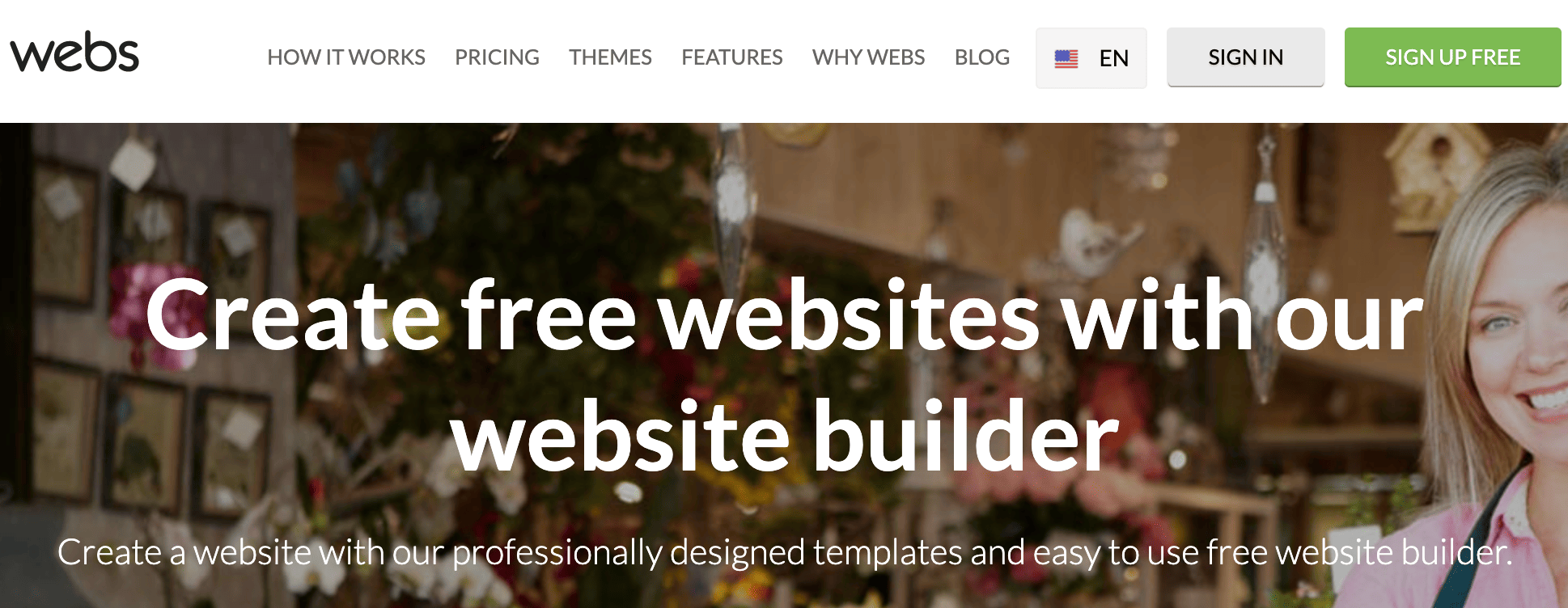
At first glance when you’re browsing through they’re site and what they offer, everything appears to be in order.
They have affordable pricing with plans starting at:
- $5.99 per month
- $12.99 per month
- $22.99 per month
Webs even offers a 30-day money back guarantee. Custom domain names and emails are included in all of their plans.
However, Webs definitely has its fair share of flaws.
The building process is actually pretty simple, but you’re going to be extremely limited in terms of your design options. The builder itself feels outdated, and your final product can end up feeling the same way.
Some browser extensions won’t work with this website builder either. Overall, the interface just feels awkward when you’re using it.
Webs is definitely not ideal for ecommerce websites and can get expensive when you start adding on those features.
For those of you who are considering the cheapest plan starting at $5.99, the only way to reach customer support is via email. That’s not ideal if you need help right away. Their middle-priced plan offers live chat in addition to email, but only the top tier plan comes with phone support.
The response time for email support is slow, according to reviews. You can usually expect an answer in about two days. I couldn’t imagine having to wait two days to get an answer about something important related to my website.
While Webs might be affordable and easy to use, it’s just underwhelming. With outdated themes, you’re going to be pretty limited with the type of website you can build using this platform.
Doodlekit
Doodlekit is another option that I’d avoid at all costs.
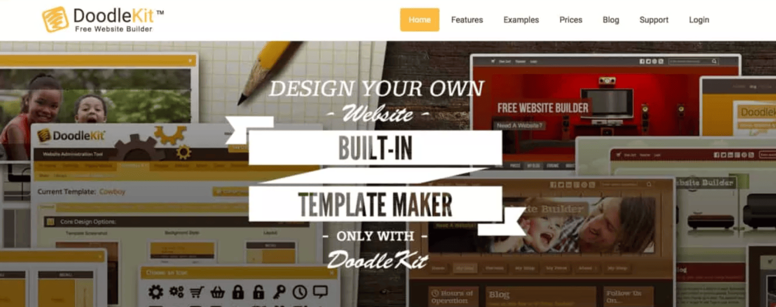
Normally, I don’t like to bash or badmouth websites, products, or services. But truthfully, Doodlekit has more negatives than positives to talk about.
It’s not user-friendly in any stretch of the word. It’s also very difficult to edit their templates.
I have lots of experience using website builders, and I found myself frustrated and confused trying to make what I thought would be simple changes.
Doodlekit has over 100 themes, but quantity doesn’t always translate to quality.
The themes are so outdated that adding them to your website would be a huge mistake. Customizing and making changes to these themes feels impossible.
Doodlekit has a free website builder, which might sound appealing for some of you who are trying to save some money. But I wouldn’t recommend that either. Their other plans range from $10 to $40, assuming you get billed on an annual basis. The month-to-month plans start at $14.
If you don’t want to take my word for it, give the free option a spin. But I’d say you should avoid the hassle altogether and find a better website builder instead.
Yola
Similar to Webs, Yola is actually pretty easy to use.
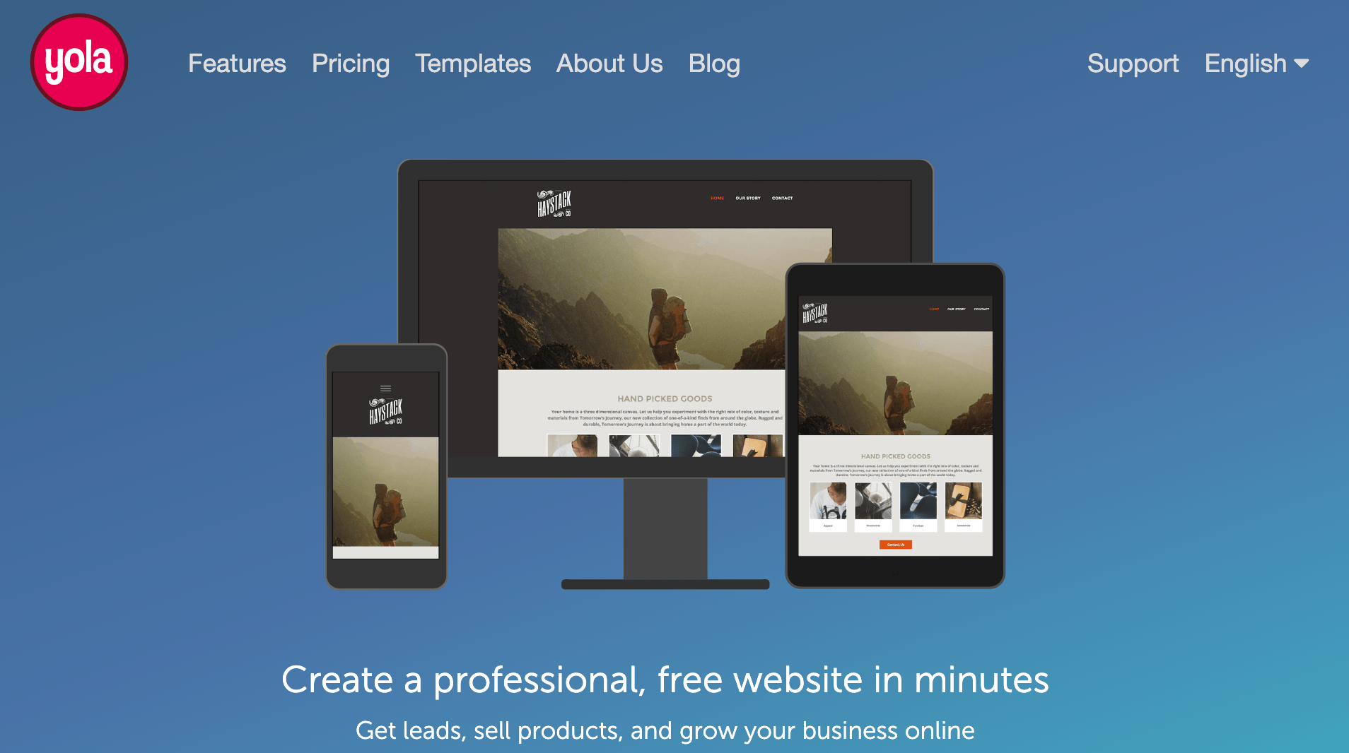
However, that ease of use comes at the cost of being very limited. While the building process isn’t challenging, it gets tedious after a while.
The templates are outdated and feel rigid.
You end up having to make so many changes to the templates that it pretty much defeats the purpose. They have more than 250 themes, but the themes look like they belong on websites that were being built ten years ago.
That’s definitely not ideal when you’re competing with websites that have responsive designs and videos playing in the background.
Yola has affordable pricing, including a free plan. But the free plan has a Yola subdomain and only lets you create three pages. Obviously, you can’t build a legitimate website like that. The sole benefit of the free plan is that it gives you a chance to sign up and test the builder out before you have to pay.
Pricing ranges from $5 to $20 per month based on annual contracts or $7 to $30 for month-to-month contracts.
All plans, with the exception of the free option, give you a custom domain. You can also add a Yola store for $10 per month to any of the paid plans.
While this sounds appealing, I don’t think you’ll end up being happy with the user experience or final website product. That’s why I have Yola on my avoid list.
Jimdo
In terms of performance and ease of use, Jimdo is actually pretty decent. You can get your website up and running fairly quickly.
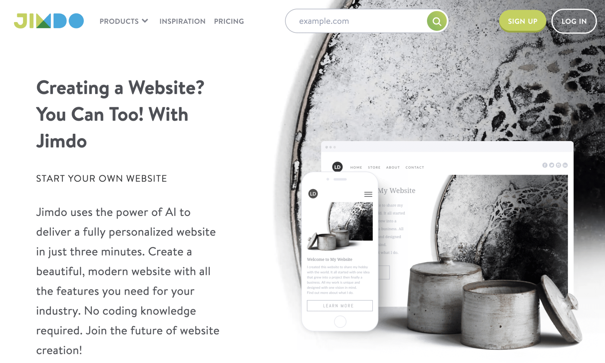
But with that said, Jimdo is very limited.
They have less than 20 themes for you to choose from. You’ll be able to change the color scheme, add text, and add images. But beyond that, building a unique website that’s fully customized with Jimdo will be a challenge.
Your final site will feel very cookie-cutter and basic once you’re done.
Jimdo offers more pricing options than every other site on this list.
- Free
- $9 per month
- $15 per month
- $19 per month
- $39 per month
They also have ecommerce options. With Jimdo, you get a free domain for a year, but then it will cost you an additional $20 per year after that promotional rate expires.
While Jimdo isn’t awful, the lack of customization options and themes hurts it in my mind. There are better choices out there for you to consider.
Conclusion
There are lots of website builders on the market today. Like any other product or service, some options are better than others.
That’s why you need to know how to evaluate a website builder.
- User experience
- Support
- Features
- Quality
- Performance
- Price
These are all factors that need to be taken into consideration.
Based on these criteria, there are definitely website builders that you should avoid, like the ones that I mentioned in this guide.
Now that you know what to avoid, check out my list of the best website builders to steer you in the right direction.
from Quick Sprout http://bit.ly/31cAH2x
No comments:
Post a Comment