How do you convince a person to do something?
When you’re having a face-to-face conversation with someone, you know how to persuade them. But you don’t have the same luxury of conversation when you’re dealing with visitors to your website.
Fortunately, you can utilize online persuasive tactics to close sales and improve your conversion rates.
Many of these factors have to do with the design of your website. The way your current website is designed could be the reason why you’re losing sales.
Some of your design choices may actually be putting off visitors and hurting your conversions. Obviously, you’re not doing it intentionally. But either way, you’ll need to address these mistakes and make the necessary changes.
Since you can’t actually talk to people who are visiting your website, you need to show them why they should do something.
That’s why I created this guide. I want to show you the top persuasive web design principles that will lead to conversions.
1. Emphasize clarity
What’s the purpose of your website?
It should be clear and obvious to anyone visiting your website from the moment they land there. They should be able to tell what you do and what you’re offering, even if they’ve never heard of your company.
Here’s a great example of clarity from the Square website:
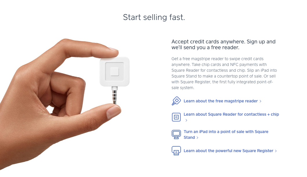
You can figure out exactly what this company does. They use phrases such as “start selling fast” and “accept credit cards anywhere” to help visitors understand what they’re offering.
Even better, they’ve got a clear picture of their product. The hand that’s holding the device is used to show how small it is, which is a huge selling point.
Pictures are a great way to clarify your message on your website. We’ll talk about how to use visuals in greater detail shortly.
Analyze your website. Obviously, you know what your company offers, but is it clear to others?
Put yourself in the shoes of somebody who has no prior knowledge of your brand, services, or products. If they can’t identify what you’re offering on your website, you need to improve the clarity of your message.
Don’t use any ambiguous terms. Get right to the point.
I know I’ve been saying how important this is for new visitors, but it’s just as important for your existing customers.
It should be very easy for people to find what they want on your website:
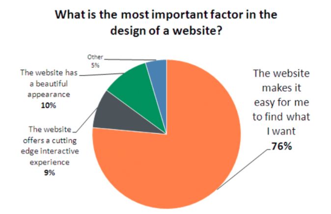
As you can see from the data, 76% of those surveyed feel that being able to find what they’re looking for is the most important factor in the design of a website.
Take some time to remove anything from your website that doesn’t add to the clarity of your message. Now it will be much easier for you to persuade visitors to buy something.
2. Use visuals
It’s easier for people to understand an image than to read text. Obviously, you’ll need to have some words on the screen, but you can let pictures do the talking for you.
Recall the earlier example of Square. The words on the screen told visitors if they buy the gadget, they can accept credit payments anywhere and get paid fast, but how can they do it?
Well, the picture was very clear. There’s a small device that can be held with your fingertips and that plugs into mobile devices.
Explaining your product isn’t the same as showing it.
Here’s something else to take into consideration. First impressions matter. You’ve probably heard it your entire life. But have you applied it to your website?
What’s the first impression people get when they land on your homepage?
A clear picture can help focus their attention and ultimately make the page more visually appealing. Too much text without any photos will crush your sales.
Take a look at this case study from Highrise:
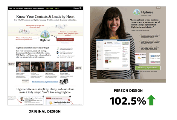
Highrise offers CRM software. Their original website had some images, but there was no clear point of focus. It was cluttered, and a visitor could easily get lost on the page, eventually leaving without converting.
Highrise redesigned their website and included a picture of a person.
What does this person have to do with their software? Nothing. But they still saw their conversion rates increase by more than 100%. Largely, it’s because the new design was much cleaner.
Using a picture that takes up most of the page forces you to choose your words carefully, which means the words on the screen are much more impactful.
Make sure your page has a simple, clear layout, featuring at least one image as the focal point.
3. Prioritize the most important elements
As I just said, you need to have images on your website. But what if you have multiple images? Your website needs to have a visual hierarchy.
Visuals get attention, so you’ll need to make it clear which images are more important. Here are some of the best ways to do this.
First, the size of an image should clearly communicate how important it is. Simply put, the bigger the image, the greater its importance. If you have an ecommerce website, your top selling items should be the biggest on the screen.
You could also draw attention to elements on your website based on their position. Let’s say you’re running a new promotion you want everyone who visits your site to see.
Don’t bury it in small letters on the sidebar or in tiny print at the footer of the page. Make it big, bold, and clear in the middle of your page.
Something that’s written in huge letters across the top of the screen is obviously more important than a small icon in the corner.
Let’s review the Sony website:
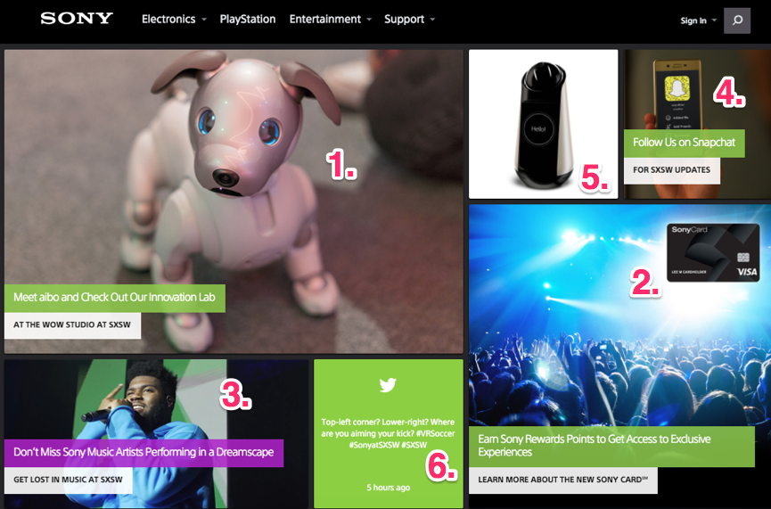
There’s a lot going on here. Clearly, this design utilizes lots of visuals.
But it’s clear which elements are the most important, according to the visual hierarchy principle. As you can see, I’ve ranked them first through sixth.
That’s how your eyes will move from one element to another, based on the size, placement, and color of these images.
Look at your website, and decide what the most important element is. If it’s not the biggest and clearest element on the page, you’re not effectively using this persuasion tactic.
4. Use common language
As I said earlier, you’ll need to use a combination of both images and text to create a persuasive website.
The way you use this text will have an impact on sales and conversions. You need to make sure everyone reading your website understands what you’re saying.
Use short words and phrases to get your message across. Bullet points are great too because while they highlight your most important sales points, they also make it easy for people to scan the information.
You want to avoid large blocks of text. Nobody will read that.
Don’t use industry slang or terms people can’t understand. For some of you, this will be easy. But for those of you who are in industries like manufacturing or technology, it could be a challenge.
I’ve got a trick to help you determine whether or not you’re using common terminology. Do you have a son, daughter, niece, nephew, cousin, or younger sibling who is in elementary school?
Have them read your website. If there are words on the screen that a 5th-grader can’t understand, get rid of them. Don’t try to sound like a doctor or a lawyer, even if you are one.
If people can’t understand you, they won’t buy what you’re selling.
5. Use colors to improve conversions
Different color schemes can impact sales on your site.
It comes down to psychology. Our minds have certain associations with colors based on how they are used in our daily lives.
For example, green is associated with go, and red is associated with stop. It makes sense to test a green CTA button.
Here’s another example. What color is Valentine’s Day? Obviously, days can’t be a color. But I know that didn’t stop you from thinking about red and pink.
Know your customers. Are they male or female? What part of the world are they from?
These questions will help you come up with a color scheme that drives sales.
Here are some colors that men and women like and dislike the most:
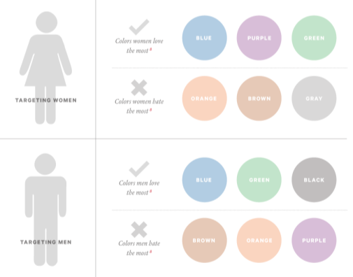
Figure out what emotions you want your customers to have when they’re visiting your website.
Once you come up with the answer, you can appropriately change your color schemes to influence people’s actions.
6. Limit choices
How many products is your company selling?
Some of you might have an extremely limited product line of just a few times. But those of you selling hundreds or potentially even thousands of items on your website need to pay close attention to this section.
Yes, I’m sure all your products are great. But that doesn’t mean you should try to cram 100 products onto your home screen.
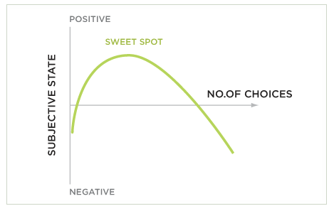
Be selective. Understand the paradox of choice. It’s a simple concept. The more choices someone has, the lower the chances of them making any choice at all:
My recommendation would be to focus on your products that sell the most and have the highest conversion rates and the largest profit margins.
Put these on your website as the focal point. Let your other items be found through a search feature or something like that.
You could potentially even eliminate some items from your product line to make choosing easier.
If people have too many choices, they are also more likely to have buyer’s remorse. They’ll constantly think about an option they could have bought instead, which gives them a bad feeling.
As a result, they could have a negative association with your company as a whole.
The best way for you to be persuasive is by offering fewer choices.
7. Use only one CTA on each screen
This piggybacks on my last point.
I see too many websites try to add multiple call-to-action buttons all over each screen in an effort to get multiple conversions. But instead, they’re missing out on sales.
Too many CTAs will confuse the visitor. Giving them too many choices won’t lead to conversions.
I understand you may be trying to accomplish many different goals on your website. But don’t overwhelm your visitors.
When you want to drive sales, your CTA should mirror your goals.
Have all the other elements on your page leading toward one CTA.
8. Implement patterns
People get used to patterns.
When you implement patterns on your website, the visitor will know what to expect as they continue.
One of the best examples of this in terms of persuasive web design is the scrolling feature. As the visitor scrolls down the page, they see more information.
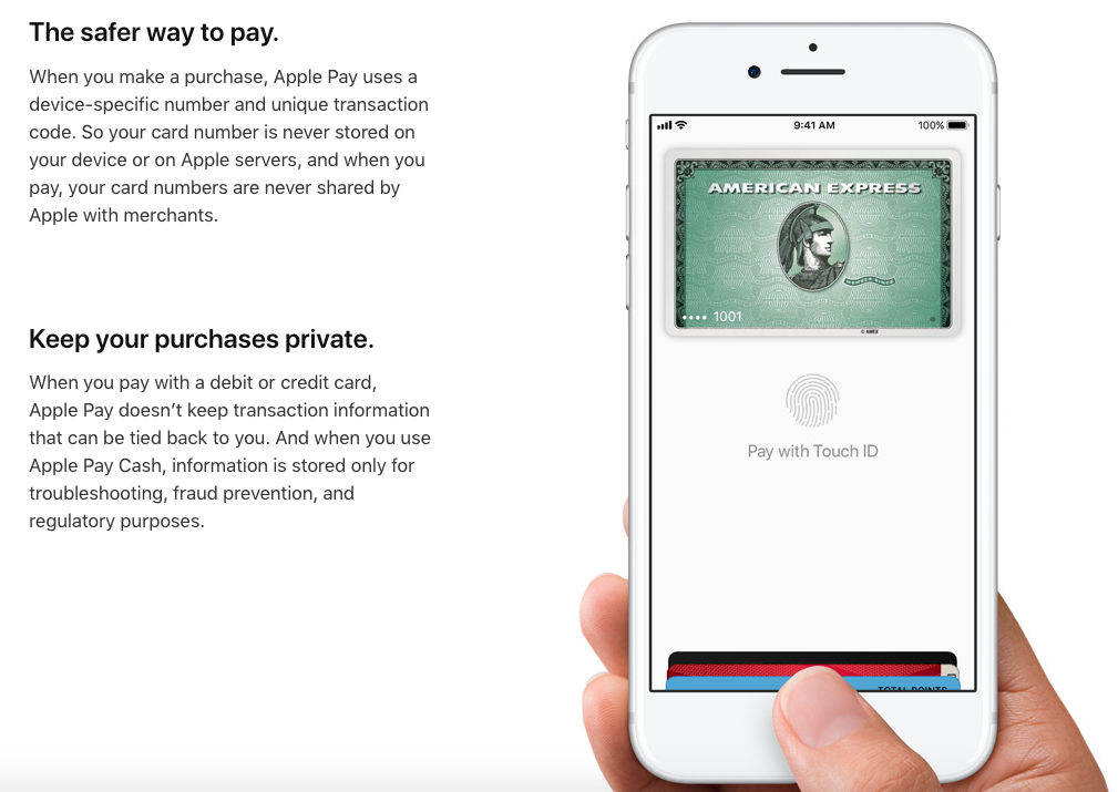
Here’s what this pattern looks like on the Apple’s website:
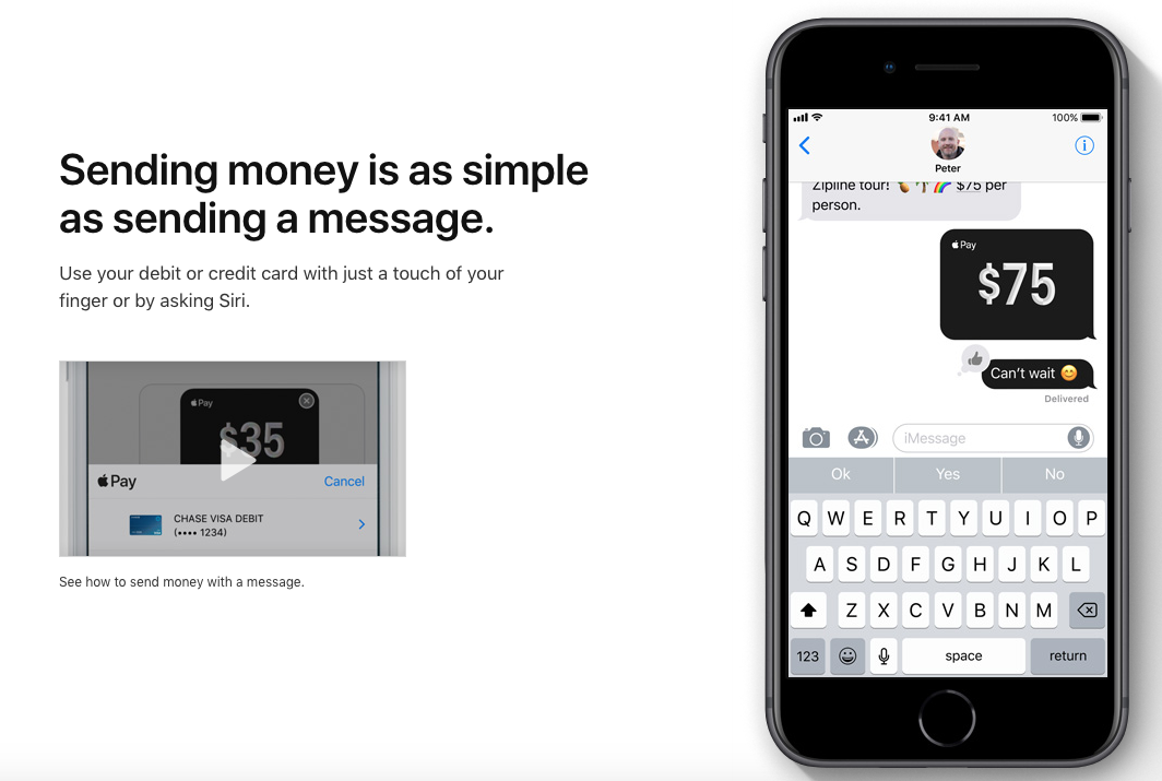
This is one of the first screens you see when you start scrolling on their website to learn more about Apple Pay.
There is a heading with some text on the left side of the screen and an image on the right side of the screen. As you continue to scroll, this is the next image you see:
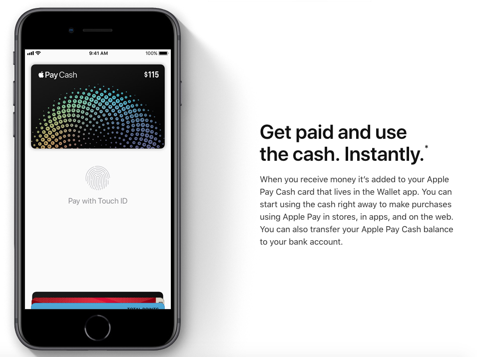
It’s similar, but not exactly the same.
Instead, the image has flipped to the left side of the screen, while the heading and text have moved to the right.
If the pattern is to continue, what do you expect to see on the page as you scroll down even further?
Exactly. The image is back on the right and the text is on the left.
It’s a very simple pattern, but it’s effective. People have a greater chance of retaining this information if it’s presented this way.
Imagine if they tried to cram all three pictures and all of the text onto one screen. It would be a cluttered mess.
The pattern they used creates a clean design and simple navigation. Visitors don’t have to click on anything or navigate to a new landing page. All they need to do is continue scrolling.
This persuasive tactic helps focus the attention of your website visitors. Websites with simple designs have higher conversion rates.
If a company as successful as Apple is using this strategy, I think it’s safe to say you can follow their lead.
Conclusion
You might be a persuasive speaker, but that won’t help you create sales on your website.
Instead, you need to implement persuasive design principles to convince visitors to buy whatever you’re selling.
It starts with clarity. Make it extremely obvious to everyone what you’re offering.
Add visuals, and prioritize the most important elements on your page according to the visual hierarchy rules.
You’ll need to use text as well. But make sure you’re speaking in terms everyone can understand.
Create a color scheme that speaks to your audience. Limit choices, and create patterns.
Stick to one CTA per page.
Follow these persuasive web design tips if you want to improve your sales.
What persuasive design elements have you implemented on your website?
from Quick Sprout https://ift.tt/2IQAMyP
No comments:
Post a Comment